Inside me there are two wolves: one who likes organizing stuff in her day-to-day life, and the other who gets overwhelmed by coding/ computer skills in general. The wolves are currently caged inside Google Sheets, where they have to figure out how to do the fun task of organizing an online collection, against my confusion of coding in CollectionBuilder!
The online collection I’m building is called the “Indigo Art Index,” and features objects, media, and artists which utilize indigo dye in their making or practice. Its going to function as a repository for the many works I reference in my research, whose articles or art otherwise become scattered across my desktop. Similar projects exist, like a crowdsourced indigo resource list which was started by the International Center for Indigo Culture. But unlike the communal resource list, mine is a solo endeavor, which is reflected in the bias for West African and American indigo dyeing in the site.
Creating the index has been an uphill battle, challenging me to learn new skills in coding and on the organization of data. Staring at the blank spreadsheet which would become my data input was daunting, as I didn’t quite understand how text the would translate into a website without typing directly in the site (as I am doing right now). I felt like I was back in high school math, stumped on how to solve an equation because I didn’t understand why I was solving it, how the process works, and where each step was taking me. It was this same need for comprehension which I worked through with this project. I began understanding how the sheet would work when I entered the data for YouTube videos. When typing in each video’s URL, I thought about what components of a URL were unique to the video, and how they would direct back to the site. Simply learning which parts of the URL to include, and what to exclude, helped me think of the whole project as a translation of commands into machine language. Asking how to translate actions into coding then helped me understand where each subject should go, and the importance of consistency within each subject. In Karl Broman and Kara Woo’s article, Data Organization in Spreadsheets (2017), they breakdown the need for consistency across data on spreadsheets for more accurate translations of data. Reading their article made me think beyond what row or column a dataset should go in, to ask why their organization matters. That reason being to delineate between what data can be programmed and which is better for analysis, thus separated from the sheet. So, just like high school math, I worked through the confusion, did my best to format all parts of the sheet with consistency and clarity, and finished with a collection of ten objects. The coding portion was a bit easier, as the format of the sheet did most of the heavy lifting, and GitHub’s interface is beginner-friendly. After a couple of minutes coding and uploading files, my project was published. And like my ACT score, which was just good enough to get into college, so too did I power through the practice and publish a trying first start to my project!
Now that I have published my first project, there are improvements which I would like to implement in the future. The first improvement I would correct is a technical one, which is that the images won’t load… Even though the datasets are accurate and the files uploaded successfully, the images are blank in the home page carousel and browse page! This problem will hopefully be corrected soon. The next improvement I would like to make is on the descriptions. I chose to keep things simple, giving credits about where each of the images come from, and brief context for why I chose to include the listed artwork or artist. But in leading with simplicity, these singular images of artworks and artists do not provide enough context as to their oeuvre, or the art objects themselves. This problem of how objects are photographed and digitized, and whether or not the digital image can acts as a surrogate for the physical object, deserves to be investigated further in my project, which particularly concerned the tactile experience of fiber arts.
The next two improvements would add to the project, while addressing the pitfalls listed above. The first would be to add more photos of the listed art objects, while finding a way to group them by artwork, as well as artist’s oeuvre. An additional step I could take to represent the tactile nature of the textiles could be including photographs which show the texture of materials in different lightings. I’m envisioning a format similar to my last article, “Thinking Beyond the Digital and Material Divide,” where I could include candid images of textiles taken with uneven lighting and dynamic angles. These angles complicate the studio photographs taken of art objects. This would require onsite visits for many works, so this is a vision more than an actionable goal at this moment. But this idea of complicating images leads me into my final improvement, which is to complicate the data through relational databases. I am inspired by the project Mapping Senufo: Art, Evidence, and the Production of Knowledge, which was undertaken by African art historians and curators Susan Gagliardi and Constantine Petridis. Their project, which intended to complicate the ways museum tombstone labels are written on Senufo art through relational databases, has presented a more engaging way to think about the presentation of my own data. In their joint article discussing their project, Mapping Senufo: Making Visible Debatable Information and Situated Knowledge, they write on the importance of complicating dates, such as including all dates for provenance and including transparent visualization on changes to and biases in data. While my project does not currently include historic art objects, I take their argument for multiple dates into account with the inclusion of Youtube videos because both videos were uploaded years after their production. For each video, I input their production dates as their date on the timeline page then included the upload date in the image description. Future updates could include those dates as their own separate column on the dataset. Finally, I am using this blog post to practice relational awareness in data input, as I hope my candidacy on the struggles, pitfalls, and goals moving forward in my project illuminate my biases and intention in this project’s current form.
As I move forward with this project, I hope to receive insights on further improvements which can be made, and ideas for growth! As it stands, I’ve successfully taken my first steps into the digital art world, and can only grow from here!
As a textile historian, my research often places me in the room with the objects I study. The tactile experience of seeing and handling the art teaches me not only how a cloth was made, but why its artist(s) chose to create it with a particular material or design. So when I approached this week’s readings, all about the digitization of art, images, and text descriptions, it is fair to say I felt out of my element. It’s one thing to analyze the art object through the screen, another to analyze the affect of the screen itself! But reflecting on my practice with digitization tools and how they pushed me to think beyond the material aspects of experiencing art, I’m inspired to understand the visualization of textiles using both a physical and digital space.
In “A Field Guide to Digital Surrogates: Evaluating and Contextualizing a Rapidly Changing Resource,” author Emma Stanford makes the case that the reproduction of art through images needs to be investigated for both its benefits and limitations to object interpretation in the digital age. She sees the danger of digital images to be their limitless reach and reproduction, and proposes historians combat this by writing metadata for images and having said data by accessible to the public. In her words, this solution tackles the root of the problem with the “digital surrogacy” of online images, which is that, “there are no bad digital surrogates— only misleading and poorly described ones (Stanford 2020, 2010).” This sentiment came up in another context this week, as I was preparing for my lesson plan on the history of photography, in which my class and I were discussing how we interpret photographs versus paintings. Similar to the opening of Stanford’s essay, the focus of our class was on the innovations of William Henry Fox Talbot’s calotype and his subsequent book The Pencil of Nature. To illustrate the pervasiveness of facsimiles today, which Talbot himself predicted, I had the students scroll through their social media and consider what images they saw, for what reasons, and the quantity of images that appeared on their screen. As we discussed the exercise, an observation was made that many images posted by influencers, companies, and even real-life friends were composed to look candid, when they were actually staged for the photo, and then curated to share. In other words, their presentation does not tell a full story. Interpreting Stanford’s concern for digital facsimiles with this conversation prompted me to think about the contemporary state of digital collections, where the viewing experience with an object is up to the quality and number of photos uploaded to a database.
What is included, omitted, or particular to digital collections, edited from the final photo will not invoke the same looking experience one would have seeing the physical object up-close. I can attest to this fact, as there have been many textiles I needed to see up-close before determining their aesthetic and/or material qualities. Take for example, this gara cloth (a wax-resist textile made in Sierra Leone) that I had the opportunity to see in-person at the North Carolina Museum of Art. Before viewing the work, I did not have many thoughts on it, beyond that it used a resist-dye technique I wanted to see for a research project.
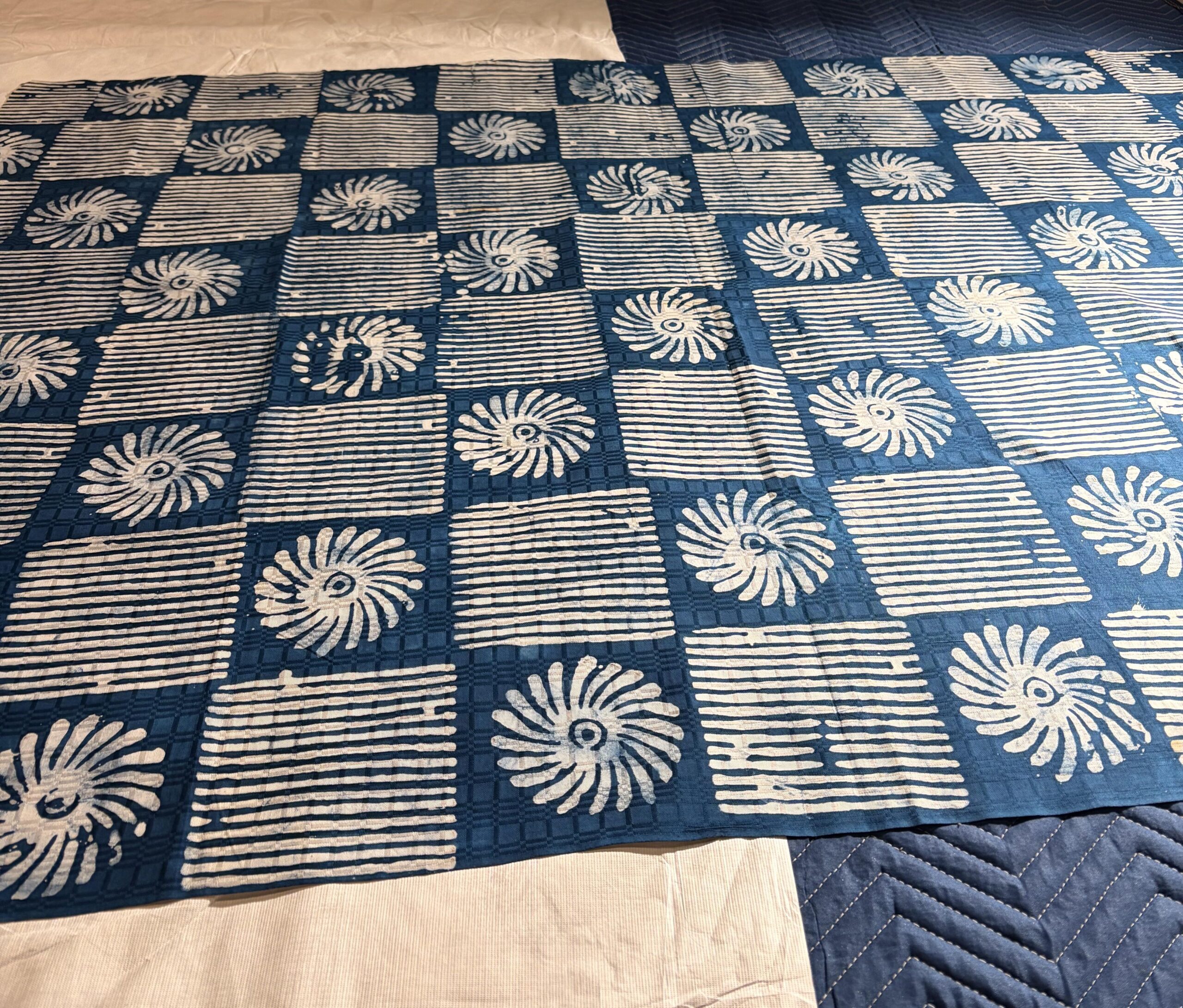

On the left: Photo of gara cloth taken in the North Carolina Museum of Art’s collection by me, June 26, 2026.
On the right: “Wax-stamped resist-dyed Textile (gara),” early 1970s. Synthetic, indigo, and kola nut dyes with various resist techniques, on damask cotton cloth. North Carolina Museum of Art, 2020.9.3. Photograph taken from their collections website.
But upon seeing this textile in person I was drawn into its beauty. Until I viewed it in-person, I didn’t realize the damask (satin-weave) cotton which backgrounds the indigo pattern has a gridded, reflective surface. This one layer added a dimensionality to the cloth I would have never seen in the digital image. Even this image doesn’t do it justice! Moving around the room I was in, I realized it was this experience, moving with and looking closely at the textile in the light, which was integral to understanding its value as clothing. It is one thing to say that it has a gridded pattern which switches between horizontal stripes and flowers, and another to say that its satin sheen backing would have complimented the dyed pattern, flattering the wearer’s body and valuing this textile as a quality cloth. While the first description is not deceitful, or entirely inaccurate, it does not draw the viewer into the full experience of looking at and wearing a textile such as this one. So how do we reconcile our dependence on digital images with the absence of material objects?
Last week, when I was practicing with digitization tools for alt text and other ADA accessibility tools, I connected the interpretations of visual language they provide with the need for clarity and alternative modes of seeing with digital images. It is precisely because digital tools can’t stand in for material objects that they are an integral part of viewing art. Before this week, I thought of alt text was a tool used by and for visually impaired people only. But exploration of how it is written made me consider how visual language goes beyond just what you see in the moment. It also considers the details others can experience only through words. By reflecting on how we write about the art we observe, alt text is no longer a simple tool, but also an alternative method for collecting data. This data may help us put our own ways of seeing into a larger context.
Note: alt-text and digital images will be added to this post in a future update.
This post is a log of first exploration in digital art history. It’s a methodology which feels foreign in that I’ve never called my research skills “digital,” but familiar in that I have always conducted research with the help of online databases and resources. This is what I thought when I first heard the term, thinking it was the use of online tools and databases to conduct art-based research. And while digital sites are the tools for conducting digital art history, the reason for the methodology lies in the new design for scholarship digital forms inspire, which in turn generate new perspectives for reading history. Unpacking the community, material implications, and progressive futures digital tools make possible for research is the topic of this post.
Digital art history, by my understanding, is a term which refers to digitized networks, often activated by contemporary technologies, which invite new methods of critical engagement for historians studying art. The importance of how we critically engage with art using digital tools varies dependent on the goal of its praxis. In “The Digital Transformation of Art History,” digital humanist Harald Klinke recognized digital art history as built atop the same foundation art history has always relied on: data. He interprets our effort to describe, compare, and contextualize art objects as a from of visual data, which we record through publication. Klinke sees the use of computers, which can process large quantities of data with more accuracy and efficiency, to be a better model for visualizing and translating large swathes of data for interpretation. Also known as “distance viewing,” better processing broadens the perspectives of researchers who reorganize their interpretations of individual artists or objects in context with a larger number of data points.
While Klinke thinks back before the digital age, Jaskot thinks forward to understand how digital tools reform our interpretations of history, as well as our social relationship to art objects. In “Digital Art History as the Social History of Art,” Jaskot argues for the use of digital tools as a method for unsettling an author’s bias for what they interpret an object to mean in its social context. Unlike the limited viewpoint of human scholars, digital tools visualize without biased for symmetry or organization, balancing, “aspects of that very tension between uniformity and chaos.” The ability of digital tools to present the bigger picture engages art with audiences and ideas beyond even the scope of its intended use and maker.
This material affect, linked through digital networks, is also a concern of art historian Alison Langmead’s. She cites slides as reproduction of original artwork, then states in “Art and Architectural History and the Performative, Mindful Practice of the Digital Humanities:” “Representation is a form of interpretation and remediation, from the framing chosen, to the color balance used, to the precise technology selected. It is not a neutral act; it is materially transformative.” Indeed, our continued distance from the physical art object paired with our conflation of the image as equal to the object positions digital tools with the potential to expand or collapse our understanding of what the art object is. Additionally, Langmead sees the future of art history as a collaborative effort, citing the end of the slides library as the beginning of isolation for working on research. She sees the public yet unfinished nature of digital art historical projects as a way forward, producing knowledge, “not because it is heading towards a conclusion, but because it will always be in a state of creation and enactment.”
The ulitimate path goal that all three authors see for digital art history is public collaboration. While I have no experience participating in digital art projects, I can speak on the transformative path of art and educational channels thriving across the internet for years. Growing up as a teen on the internet, my first introduction to visual analysis was taught through educational YouTubers, who created long essays on media relevant to my interests. Such accessible content introduced me to why art history is important, and opened my participation in larger dialogue on the art through slides. Both digital databases and online communities are collaborative efforts to extend knowledge beyond oneself. And unlike digital communities built around an individual creator or story, digital art history’s biggest challenge is its retention. As touched on in class, many computer programs shut down due to low user counts or profits. These retention issues which may be aided by stepping outside of archivist projects to learn both about digital educational content.